Shop3D.ca is a Canada’s go-to place for prosumer grade additive manufacturing supplies. Selling to government, education, medical and manufacturers, they have a unique approach to B2B: ecommerce. In an effort to provide an excellent customer experience their website is optimized to allow customers to create their own orders. The website is a huge driver for the business and ease of navigation is very important.
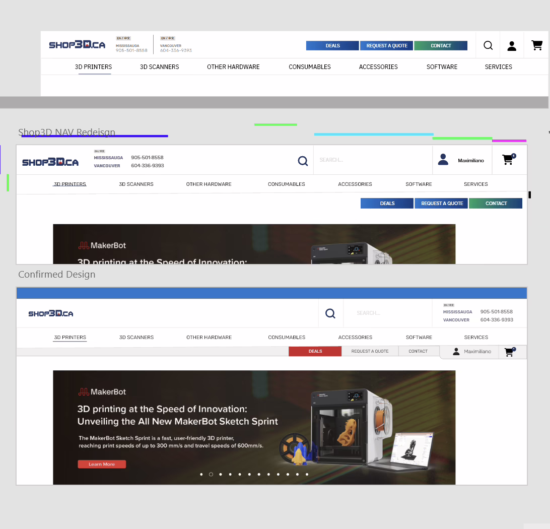
As Shop3D.ca’s product offerings grew, their traditional drop-down navigation no-longer was providing ease of access to products which was limiting customer options and frustrating the sales teams. In addition, our research showed that customers were mainly interacting above-the-fold and the small navigation limited the ability to market new products effectively.
Challenges
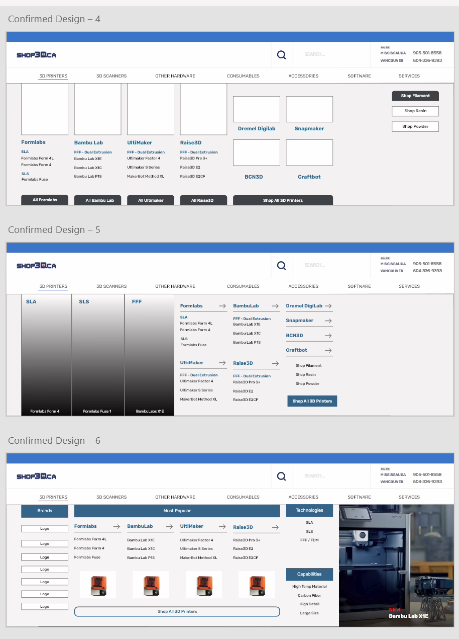
- Large Portfolio of Products: Determining the most intuitive way to order products that cover a wide variety of brands and applications, and what products need to be easily accessible or nested.
- Existing Layout: This project is a necessity but we don’t have the time budget for a full website redesign, we’ll need this to work within the existing layout’s design considerations.
- Usability: Making sure that adoption of the new layout is easy for customers and staff, and considers the mobile experience. A core benefit of Shop3D.ca over other B2B services is the accessible self-service.
Goals
- Easy to navigate to any product within 3 clicks
- Push sales and inquiries of new and lesser-known products
- Reduce negative customer experience through usability testing
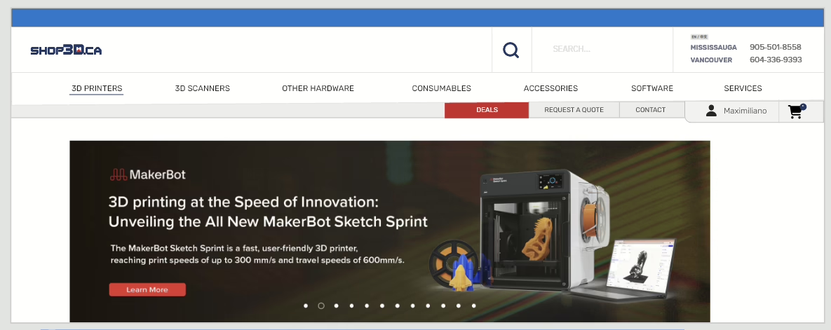
Original
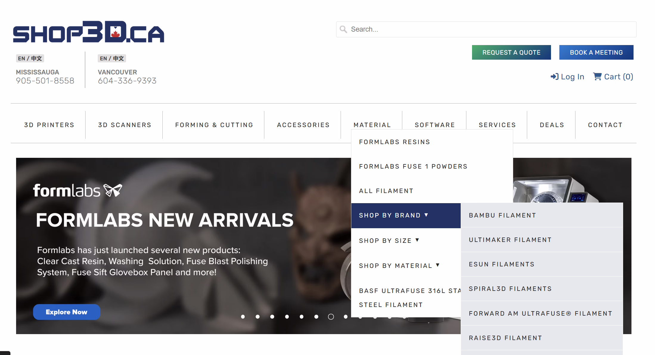
Solution
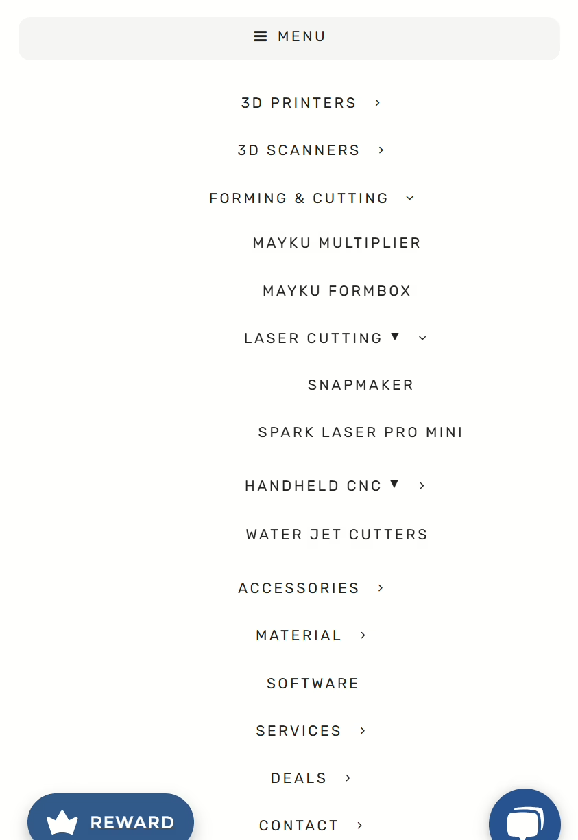
The solution was to introduce a mega-menu for the desktop experience (~60% of traffic) which could better highlight categories and offer space for advertising new or discounted products and restructure the hamburger navigation for mobile to accommodate new categories.
Redesign
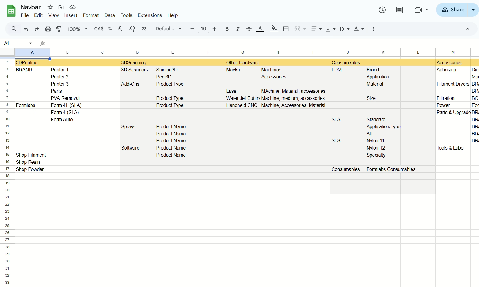
Data Collection & Planning
This project involved collecting data on how the site is used, reviewing product taxonomy, consulting with the sales and customer service teams, creating a navigation outline, redesigning the header to accommodate the navbar, designing the navbar and dropdown instances, designing the mobile navbar, website development, user testing and feedback and collection of data post-launch to identify usability issues and customer concerns. Overall, a huge (but necessary) undertaking to bring the website into the present and future proof it for further expansion into new product lines.
Development
This project was completed as a collaboration between Brandon (Design Lead at Rule1 Agency) and myself. Design, development and user testing was conducted in-house.