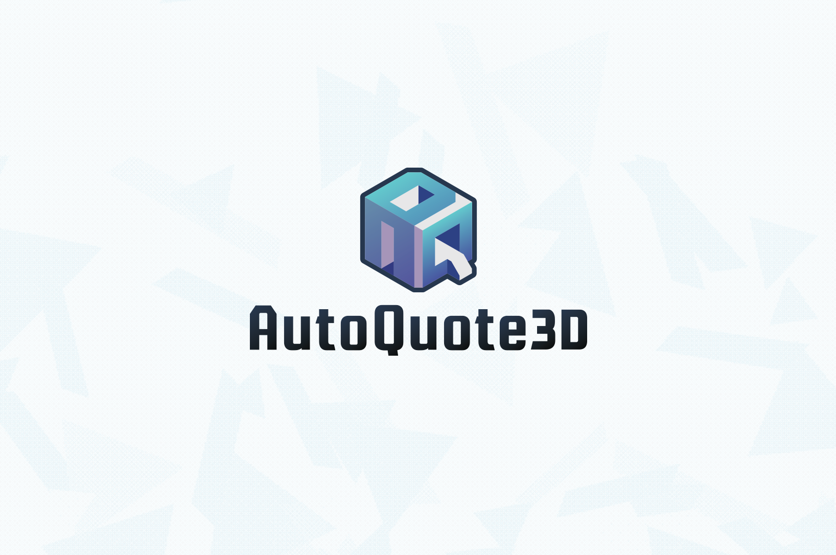
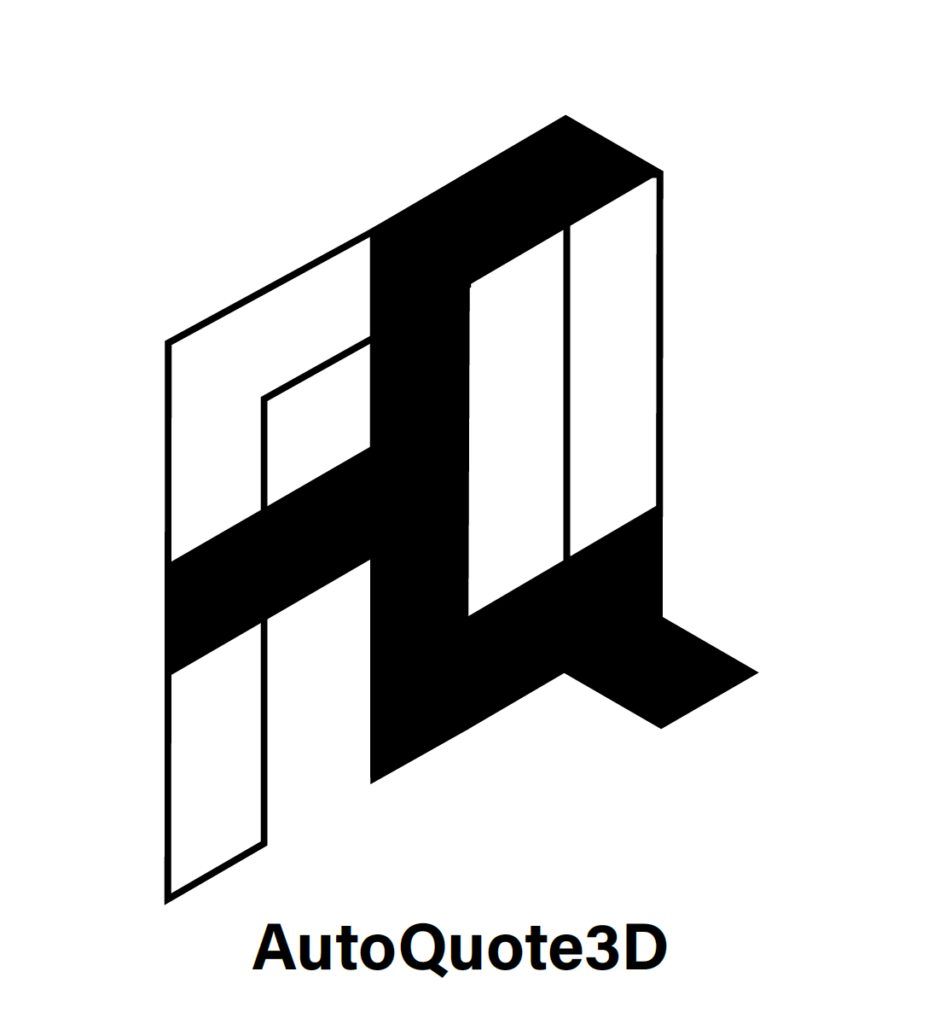
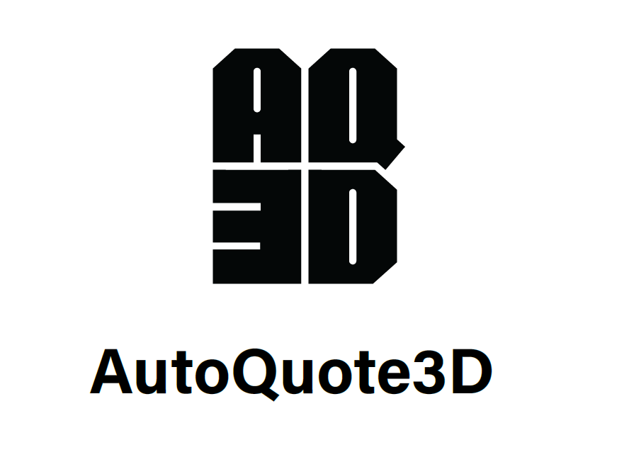
Rule1 Agency had the opportunity to develop a powerful brand identity for AutoQuote3D, a game-changing software that streamlines the quoting process for 3D printing service bureaus. This software is a must-have tool for any professional 3D printing service promising speed, automation and reliability. Our logomark demonstrates that this is an all-in-one solution. It’s stable, professional and reliable but flexible to fit the different needs of each customer.
As Creative Director, my role was to interface with the client and interpret their needs into a brief. Then communicate this with the design team, pushing them to create strong final designs. As a new SASS product, it was important to look trustworthy and established to stand out in a market where products can disappear quickly.
We wanted to convey the idea of an all-in-one software solution that can be identified in the additive manufacturing space. This product was built by enthusiasts and tested by experts, and should showcase that it’s future forward. It’s a workflow tool that is made to optimize service businesses, helping them save time, increase revenue and gain a competitive edge. A successful logo would align with these key terms.
The team’s initial exploration played a lot with form and structure. The client liked the bolder boxier designs for their impact and was partial to the isometric designs because of the possibility to translate them into 3D objects.
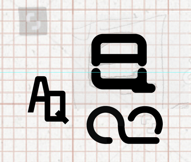
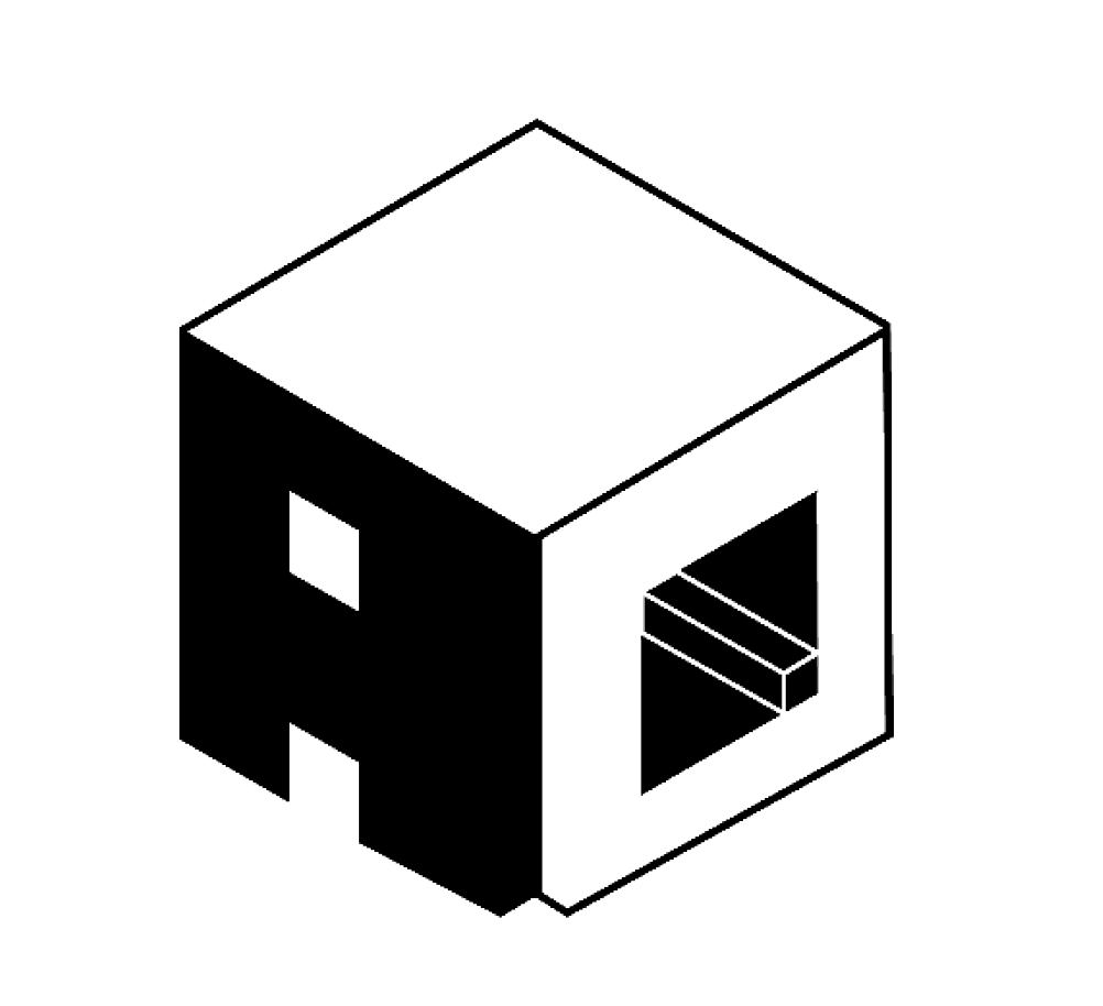
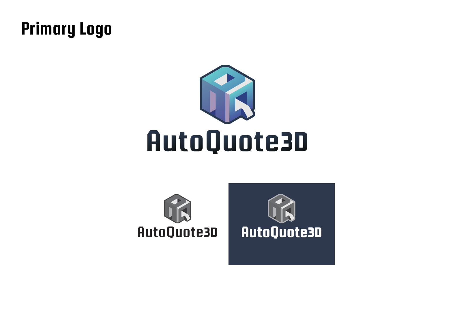
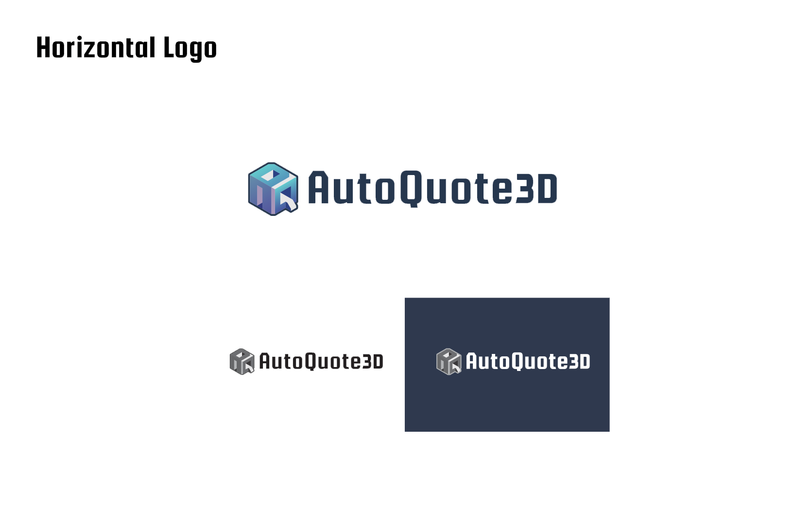
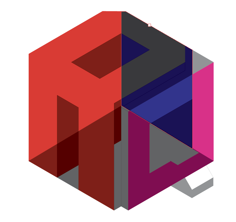
We moved forward with “the cube” because it worked well as a monogram icon and maintained that strong impactful feel. I pushed Brandon to keep exploring that shape and push the idea in different directions. Focusing on how the Q could maintain legibility and how the A could better integrate to promote the idea of an all-in-one software solution.
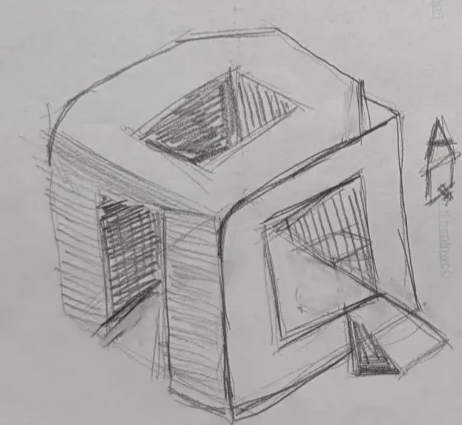

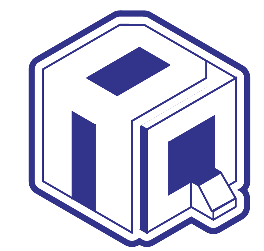
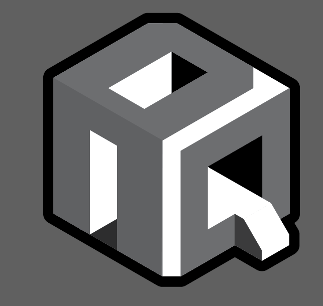
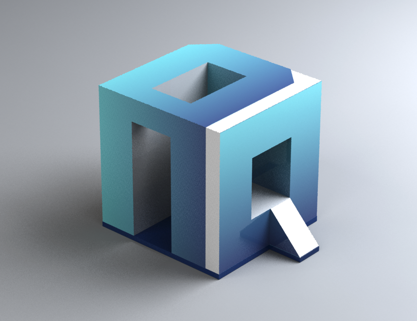
As this design developed we focused on also bringing in the elements of 3D printing: the structure, the build platform, the usb slot. Playing also with the idea of the print farm factory, entering through the A and exiting through the Q.
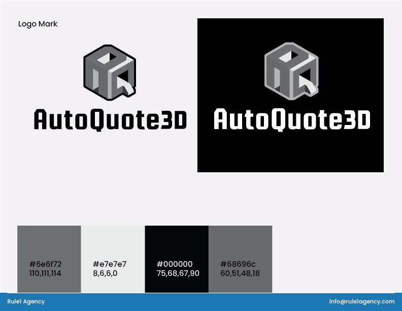
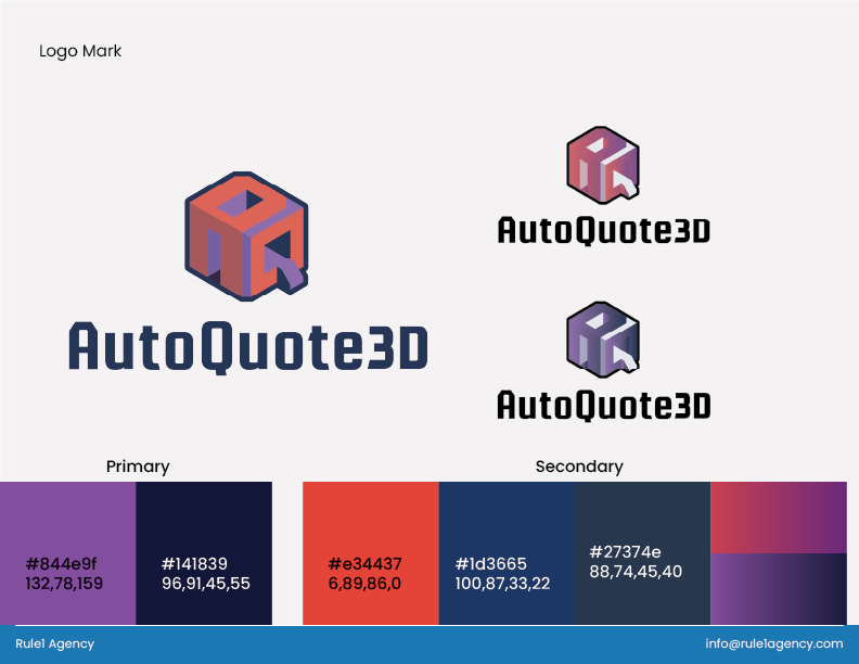
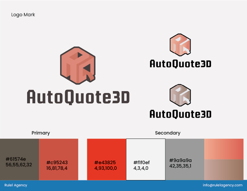
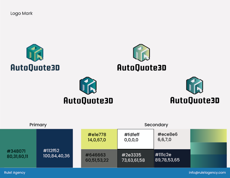
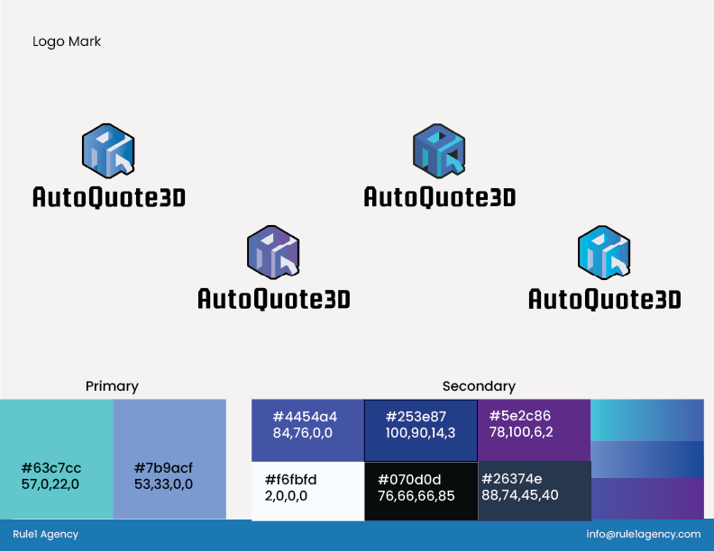
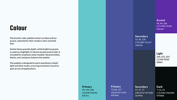
Looking at it now, I don’t think AutoQuote3D could exist as another colour. However, during development we were worried about falling into a trap of defaulting to blue. I think the strongest contenders were a monochromatic black and white and a yellow, blue, green gradient but the blue to purple gradient stood out for communicating: bold, professional and software.
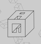
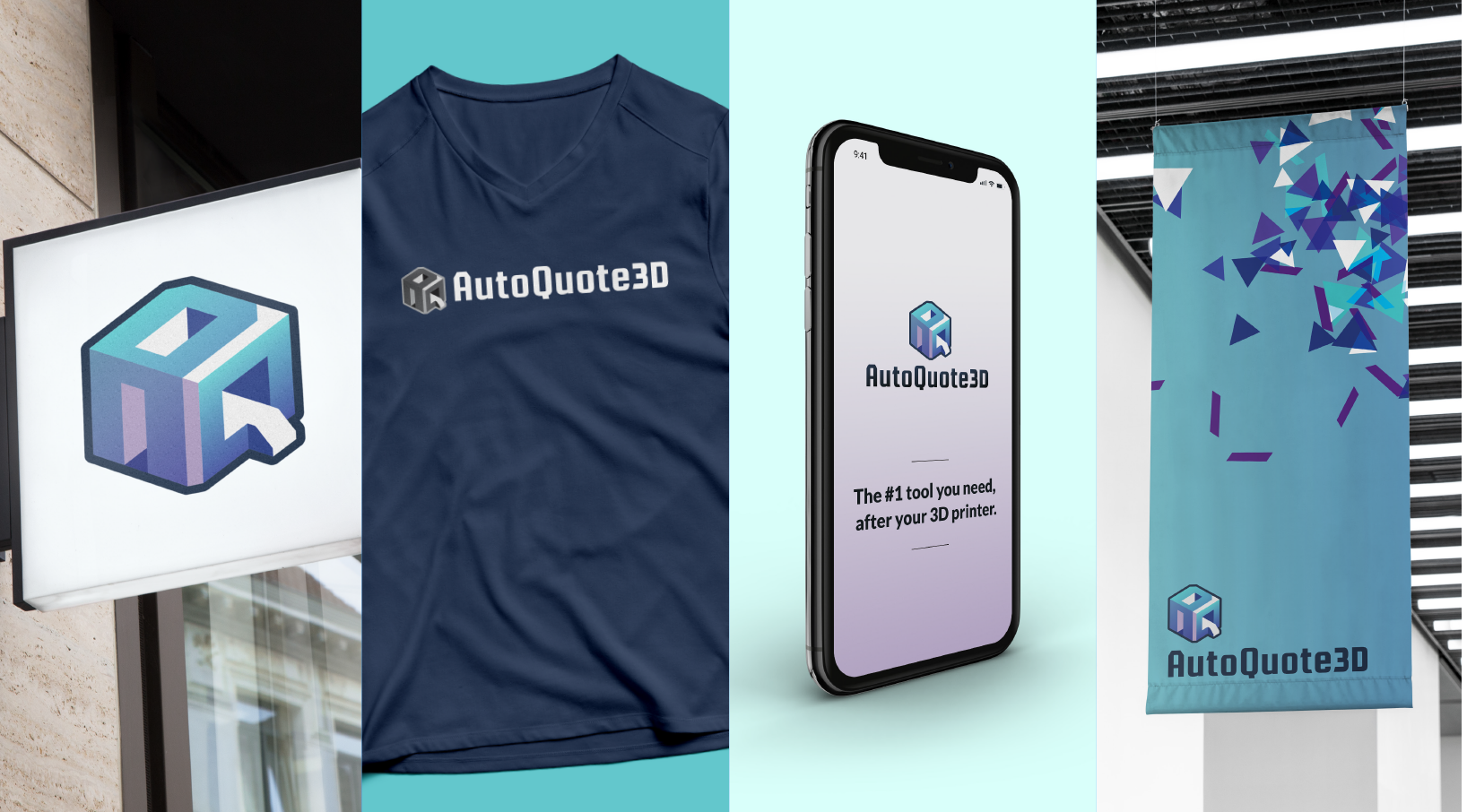
From the logo we were able to pull a variety of triangles and parallelograms. These confetti pieces celebrate the arrival of a powerful software (at a low cost), the time savings and the joy of escaping spreadsheet calculation hell. They work as a pattern to add visual interest and direction and add some playfulness into the brand. Afterall, this software is developed by some 3D printing geeks and not some soulless megacorp.
Project Credits
Creative Director – Sarah Caracciolo
Project Manager – Titilope Odutayo
Lead Designer – Brandon Grasby
3D Designer – Jacky Wan
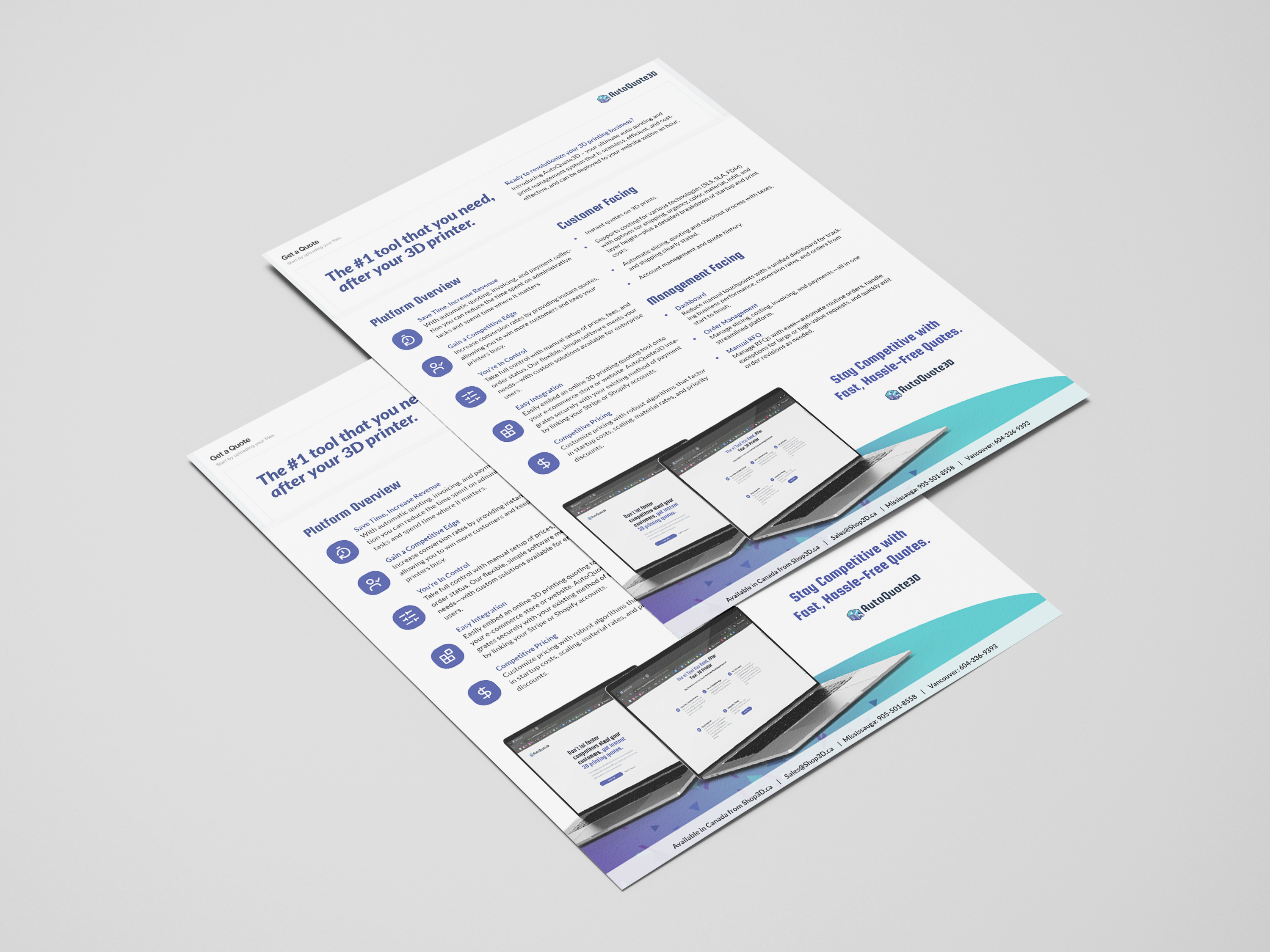
Mockups from mockups-design.com